Industry
E-commerce
Company
Americanas
Date
jun 2021
Account Screen Redesign

Redesign Account Screen for
e-commerce platform
A project to redesign the account creation screen and editing account screen, with the goal of improving the user experience and streamlining the process for customers.
📝 After working on this project, I wrote an article about best practices in forms, available in Portuguese: https://bit.ly/escrevendoparapessoas
The project & Objectives
The sign-up screen is a critical component of e-commerce platforms, as it serves to identify the user and is typically required for checkout. At Americanas, the sign-up screen is utilized in three key moments:
- New account creation: The sign-up screen allows users to create a new account and provide the necessary information to complete the process
- Editing an existing account: The screen can also be used to edit an existing account, providing users with the ability to update their information as needed
- Checkout identification screen: During the checkout process, the sign-up screen is utilized to verify the user's identity and ensure a secure transaction.
The main objectives of our solution:
- Consistent form design: Standardize the forms across all stages of the user journey for a seamless experience
- Improved metrics: Optimize the forms to enhance success rates and reduce bounce rates, resulting in a better user experience and improved business outcomes
- Higher rating: Aim to achieve a higher rating on Baymard's benchmark for form design, which was currently considered "poor." This can be achieved through implementing best practices and user feedback to improve the forms.
*Baymard: international e-commerce audit.

The process
During the process, the design thinking methodology was applied.
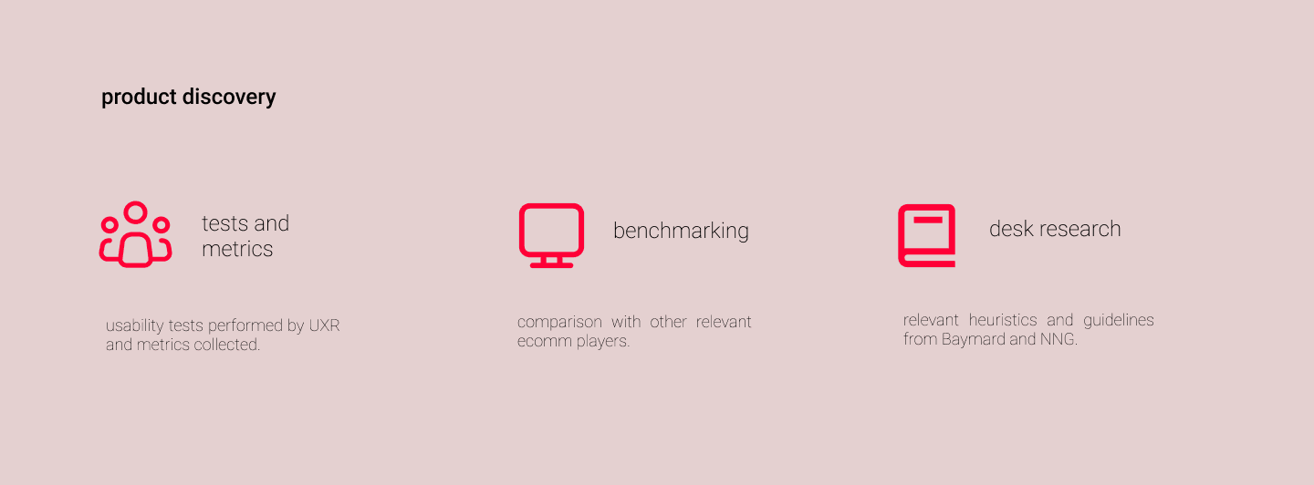
Empathize > user testing with the current scenario; metrics analysis; understand the scenario with internal teams: PMs, data, marketing, legal.
Define > identifying needs and pains: GDPR; accessibility and form extension.
Ideate > brainstorming; wireframes; CSD and card sorting.
Prototype > prototyping the possible solution: mobile; desktop; iOS app; android app.
Testing > performing user tests: moderated tests via the lookback platform.
Some metrics we had
Task success rate: This metric measures the percentage of users who complete a task without encountering errors.
Currently, the task success rate is at 26%, indicating a need for improvement in the user journey.Bounce rate: This metric reflects the percentage of users who leave a screen without interacting with it.
The current bounce rate stands at 36%, which suggests that the screen design or content may need to be improved to encourage users to engage and continue with the desired action.
📈 Source: Google Analytics data collected from the data team over a 7-day period (04/22/21 - 04/28/21)

Prototyping
Final redesign for creating accounts.

✍️ Results
Some results following the launch of our new forms:
- Task success rate: Since implementing the new forms, we have seen a 12% increase in task success rate. This means more users are completing tasks without encountering errors, leading to a better user experience and improved business outcomes.
- Bounce rate: Our bounce rate has decreased by 5%, indicating that users are engaging with our forms and completing the desired actions.
- Baymard review: Our new forms have received a high rating on Baymard, a well-respected benchmark for form design.
These results are based on data from late 2021, with mobile and desktop deployment only. :)
